Search Preference Menus: Improving Choice With Design
This is the second in a series of posts about search preference menus.
Even people who don't consider themselves "tech-savvy" understand the way apps and websites are designed can subconsciously influence people's decision making. Ethical design can empower and educate users to make the best decision for themselves. By contrast, improper design can give users the impression of freedom, when in fact subtle cues are driving users toward a certain so-called choice.
As explained in the first post of this series, we believe a search preference menu — one that changes all search defaults and includes the most common Google alternatives — can deliver meaningful search engine choice to consumers and significantly increase competition in the search market. In short, it's a great tool when done right.
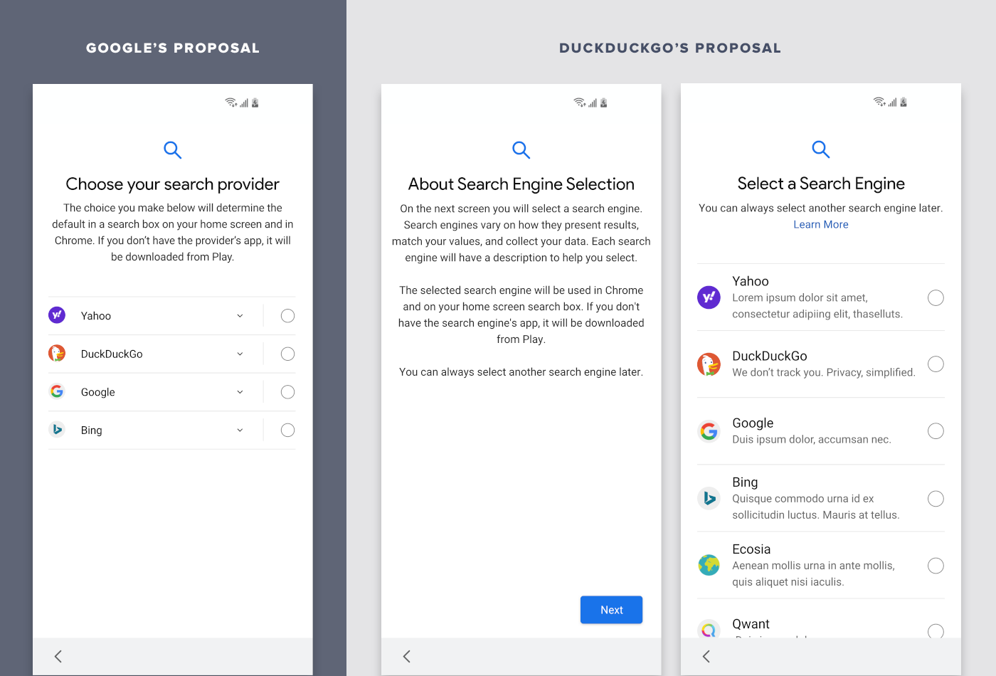
However, we believe Google’s search preference menu for the European Union is designed in a way that undercuts the very reason it was created, making it harder than necessary for people to choose an alternative.
As a result, we've suggested a number of design improvements to Google's search preference menu. While our proposed changes may seem subtle, our research indicates their impact would be significant.
Perhaps most significantly, Google has artificially limited the number of search engine choices, ignoring the option of a scrolling menu. This restriction is surely tied to the underlying pay-to-play auction model for these artificially-limited slots, which we believe is fundamentally wrong, and will be the subject of our next post.
In addition, design features like an introductory screen, automatically displaying the description of search engine alternatives, simpler language, and more, would all make a significant impact. These aren't new or controversial design concepts; in fact, they've been used before in similar situations.
DuckDuckGo's Proposed Changes Explained
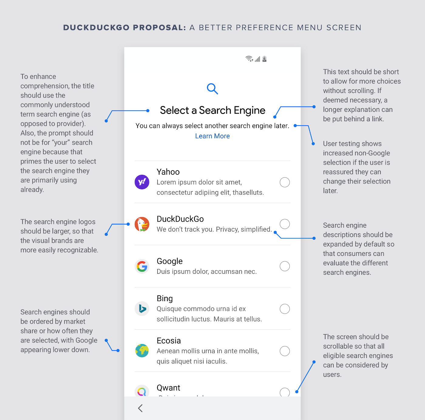
- Consumers should be able to select from more than four choices. It’s very easy, and common, to have a scrollable screen. And importantly, when we presented people with a longer list of search engines, those people selected more non-Google search engines. In other words, more choice means more diverse market share.
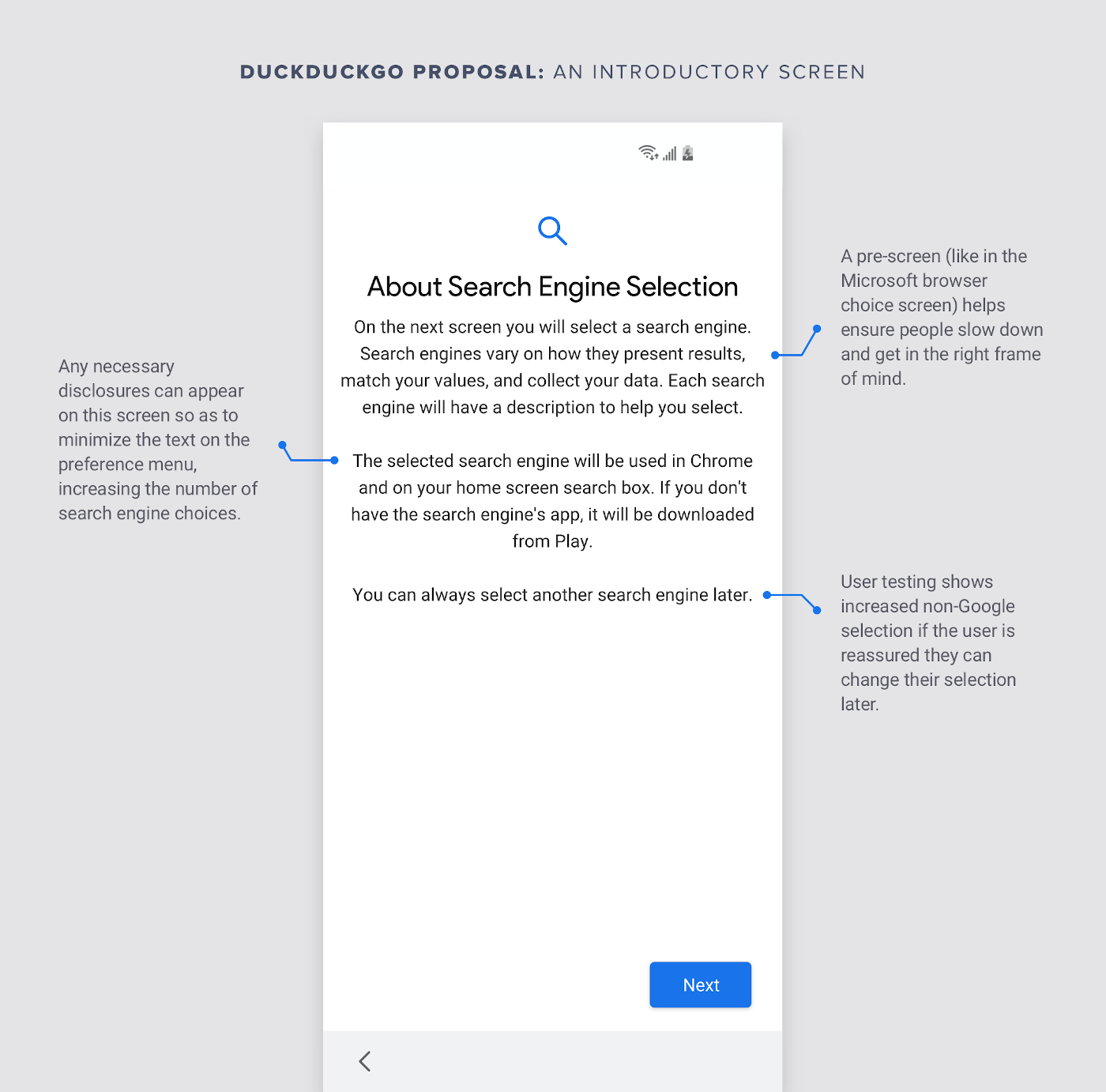
- Consumers should see an introductory screen. This helps ensure consumers slow down in the onboarding process and get in the right frame of mind to make a search engine selection. We propose a screen entitled “About Search Engine Selection.” It would explain, “On the next screen, you will select a search engine. Search engines vary in how they present results, match your values, and collect your data.”
- Consumers should be reassured that they are not permanently bound by their choice. Our user testing shows simply adding the sentence "You can always select another search engine later" substantially increases adoption of non-Google search engines.
- Consumers should be prompted to select a search engine. Consumers more readily understand the "search engine" phrasing to the more clinical-sounding phrase “search provider.”
- Consumers should be prompted to select a search engine. The title text should strike your because the vast majority of consumers already use Google, so asking a consumer to pick “your” search engine has the subconscious effect of priming most people to pick Google.
- Consumers should read concise text, without confusing or unduly alarming concepts. For example, many consumers erroneously think Chrome and Google Search are synonymous, or at least associate Google with Chrome, and so mentioning Chrome influences consumers to choose Google. Similarly, consumers are disinclined to try a new search engine if they are told that it will download software; yet, that only occurs because Android phones are pre-loaded with Google Search. Any necessary disclosures can be provided through a “Learn More" link.
- Consumers should see larger logos. This makes it easier to quickly recognize trusted search engine brands.
- Consumers should see search engine descriptions automatically. We propose a short search engine description that's automatically displayed. In contrast, Google’s design hides these descriptions unless the consumer touches a button.
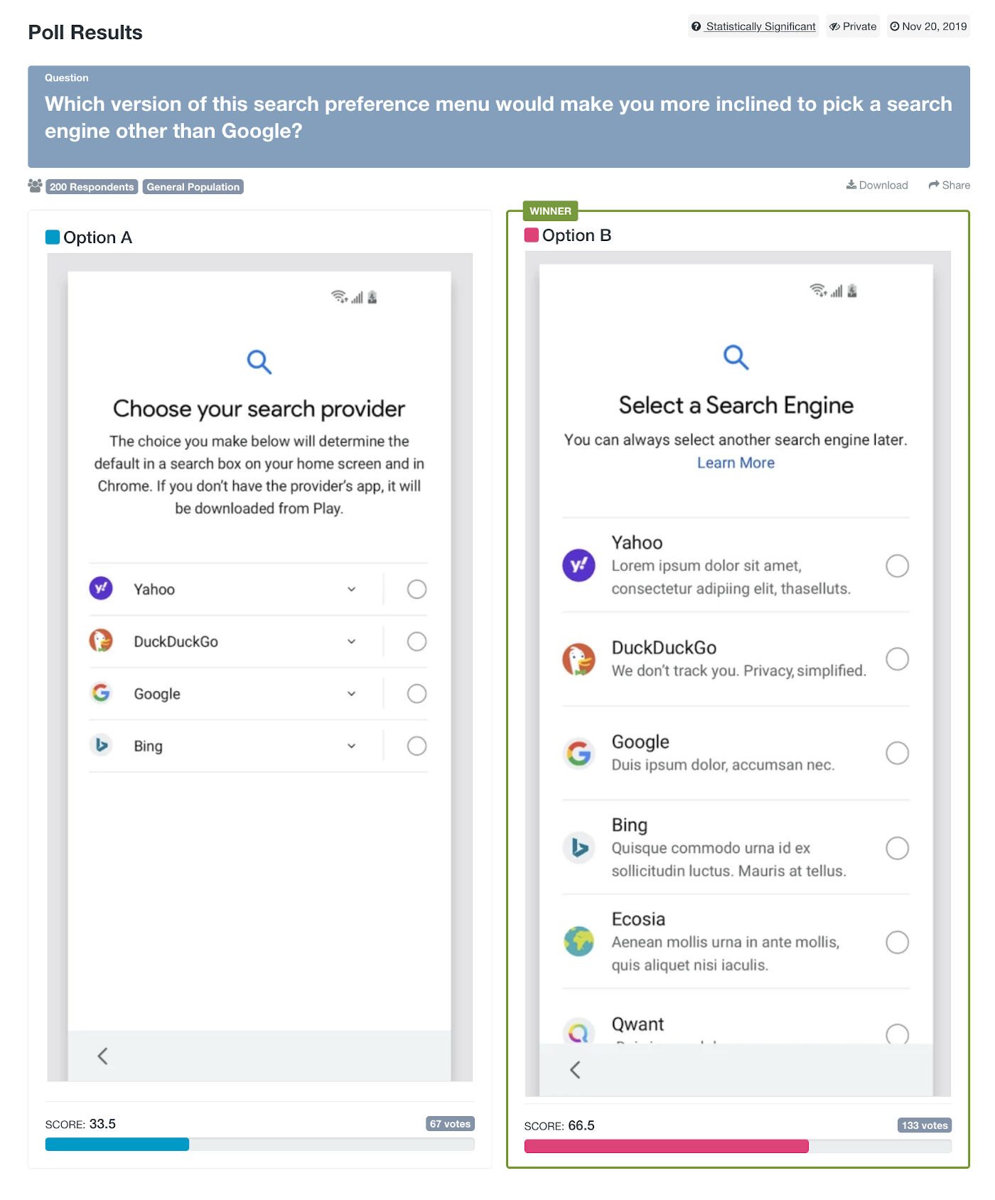
User Testing
We user-tested these design changes to confirm they would increase consumer choice. They did. We ran many user tests to isolate individual changes, though below is what the overall results look like. Consumers overwhelmingly declare, in a statistically significant fashion, that our preference menu design proposal would make them "more inclined to pick a search engine other than Google."
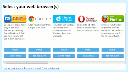
Microsoft's Browser Preference Menu
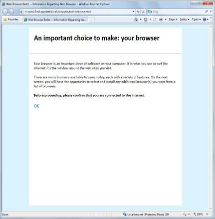
These aren't new or controversial design concepts. On the contrary, they have historical precedent. A scrollable preference menu was even used ten years ago in Microsoft's browser preference menu. In that design (depicted below), the top five browsers by market share appeared first in random order, followed by a second, randomly ordered tier. And, no browsers paid for placement!
Finally, also similar to our proposal, it also featured an introductory screen.
For more privacy advice follow us on Twitter, and stay protected and informed with our privacy newsletters.